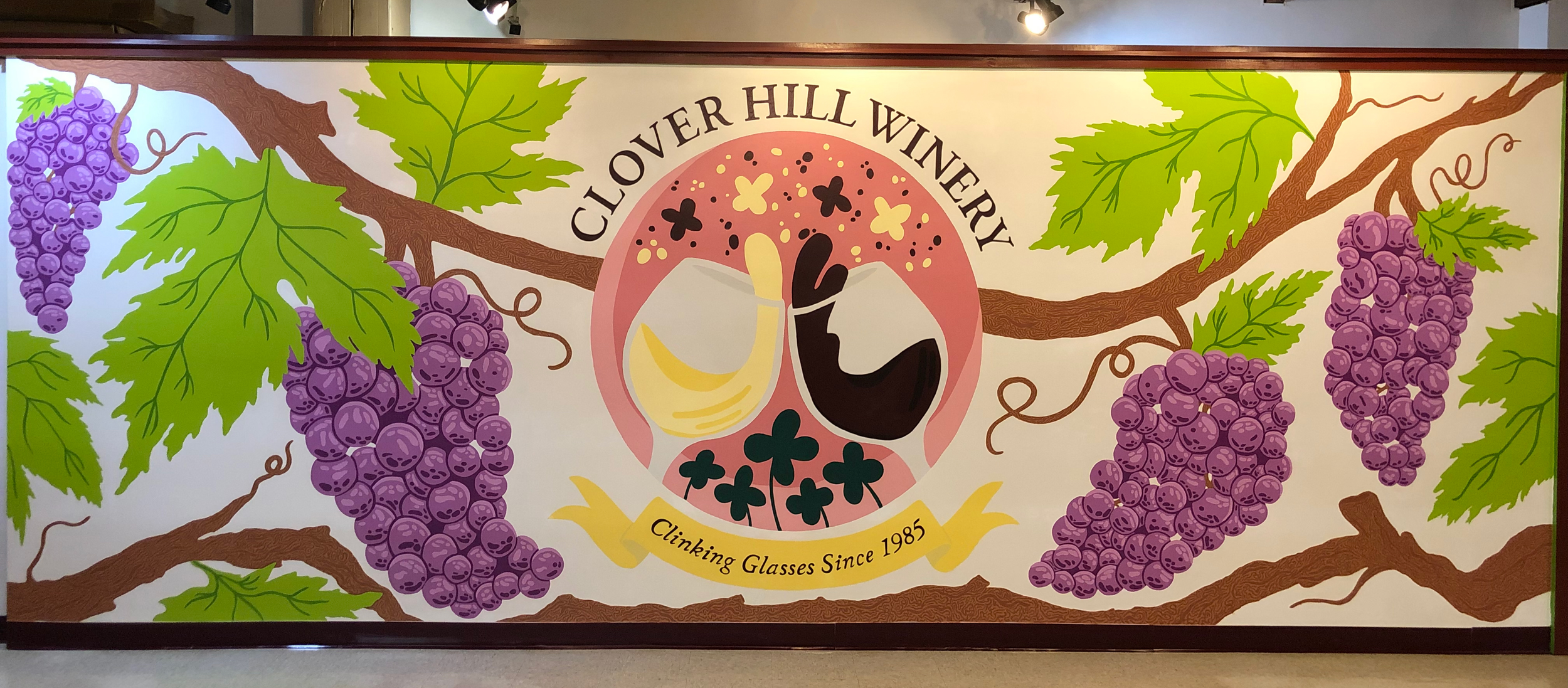
Clover Hill’s “Summer Sips” Mural
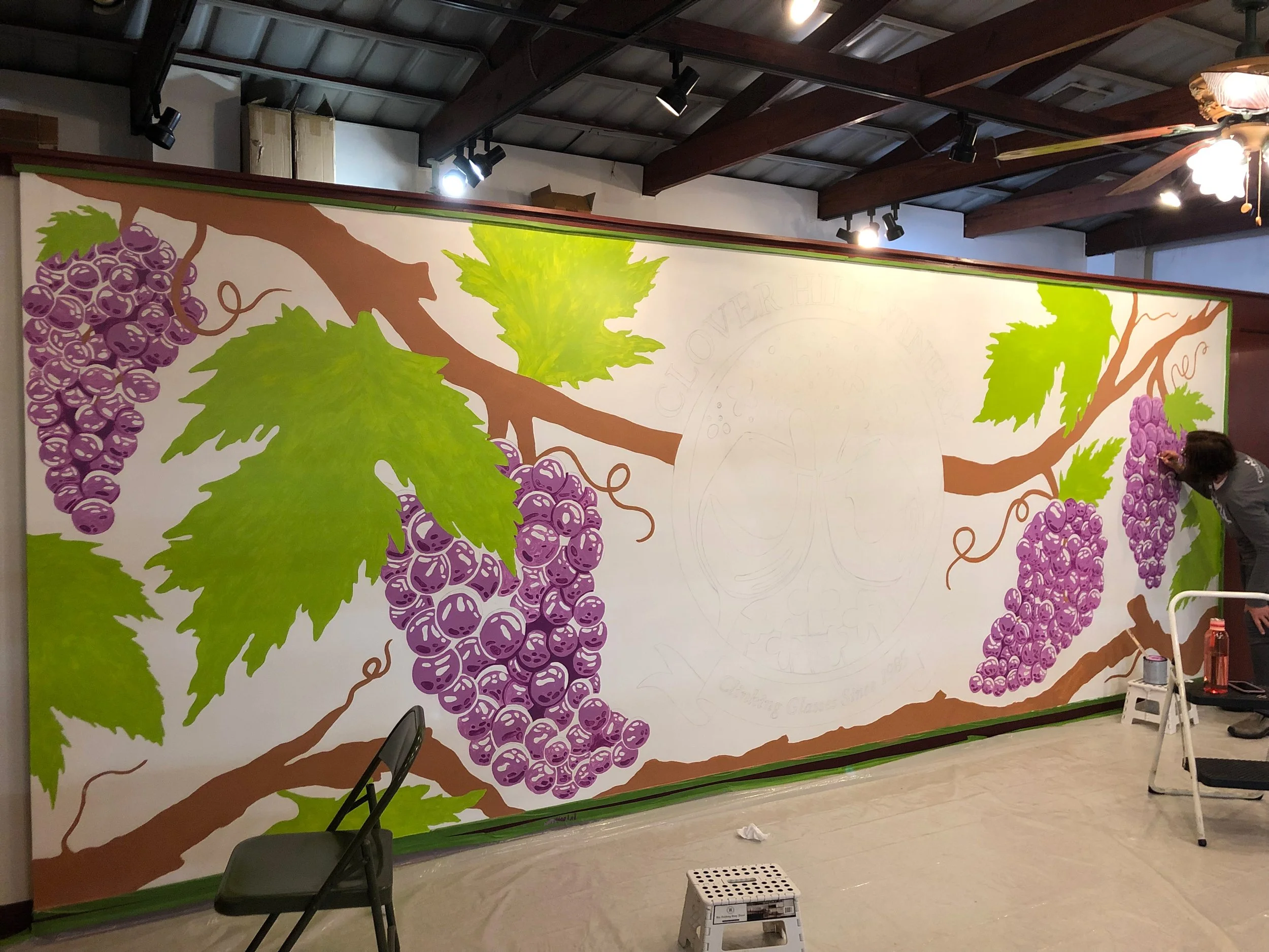
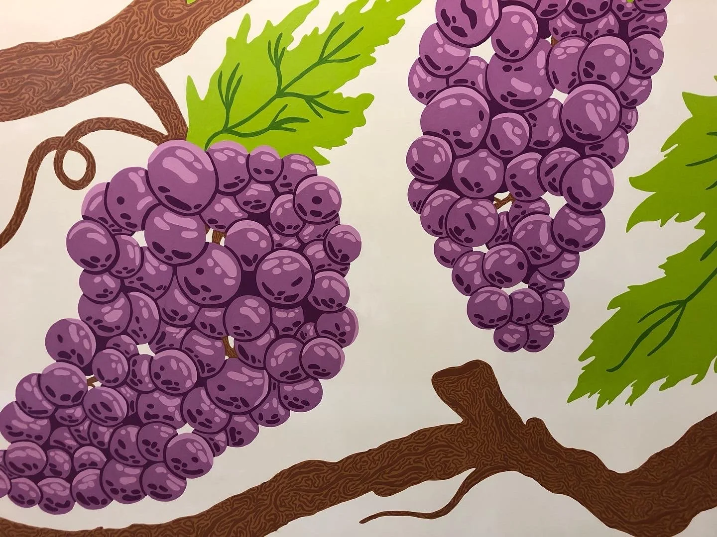
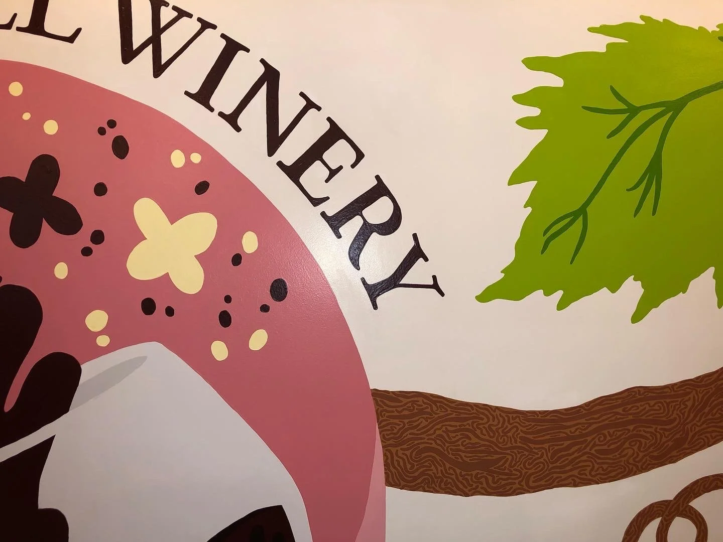
Stroll into Clover Hill Vineyard & Winery’s location at the Allentown Fairgrounds Farmers Market and you’ll find yourself surrounded by larger-than-life grapes ready for the picking! Electric greens and bold purples stand out in the otherwise neutral-colored Pennsylvania Dutch-inspired market, catching the eye of passersby and luring them in for a delicious glass of wine. This massive 20’ by 8’ work of art symbolizes the family bond that built such a successful business and the friends, family, employees, and customers that keep it going. This was an absolute treat to bring from concept to reality, and I am pleased to share that over a year later the mural still brings in old and new customers alike and continues to spread joy!


Check Out Clover Hill Vineyard & Winery
A timelapse of getting the first layers of paint on the wall. I had the help of friends, family, and employees during the rough stages of painting. I loved making it a sort of “community” project!
Development
Story & Sketches
Clover Hill Vineyard & Winery started when John Skrip happened to read about grape growing and winemaking inside a pamphlet during an airplane ride. It sparked his interest in planting that first grape plant with his wife, Pat, 35+ years ago. Fast forward to today and the business is flourishing as a family-ran establishment with four locations in Pennsylvania!
One of John’s children, Kari, asked if I could bring something fresh, bold, and energizing to their location at the historic Allentown Fairgrounds Farmers Market by way of a mural. Despite having no experience with such a thing, I knew I could do that and so much more.
Not only was this mural meant to refresh the market, but I was determined to create a monument to honor John, Pat, and everyone else who make Clover Hill what it is today.
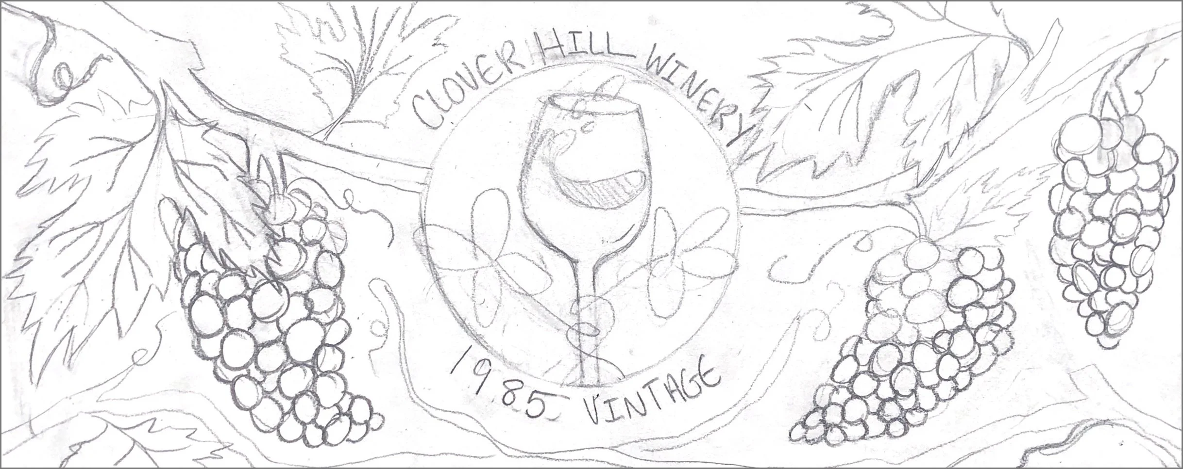


Red, White, or Rosé?
Red, White, or Rosé?
Combining Ideas
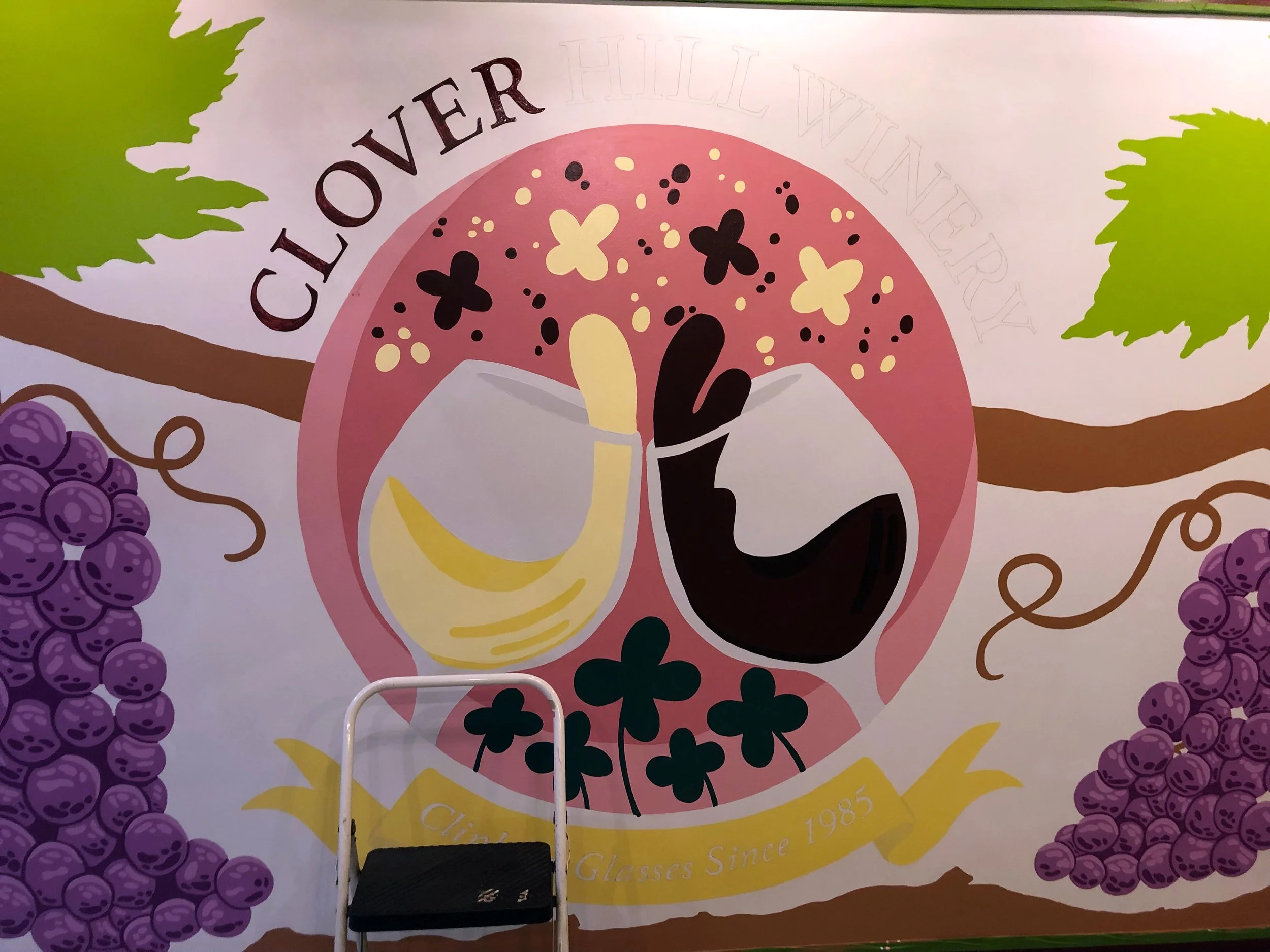
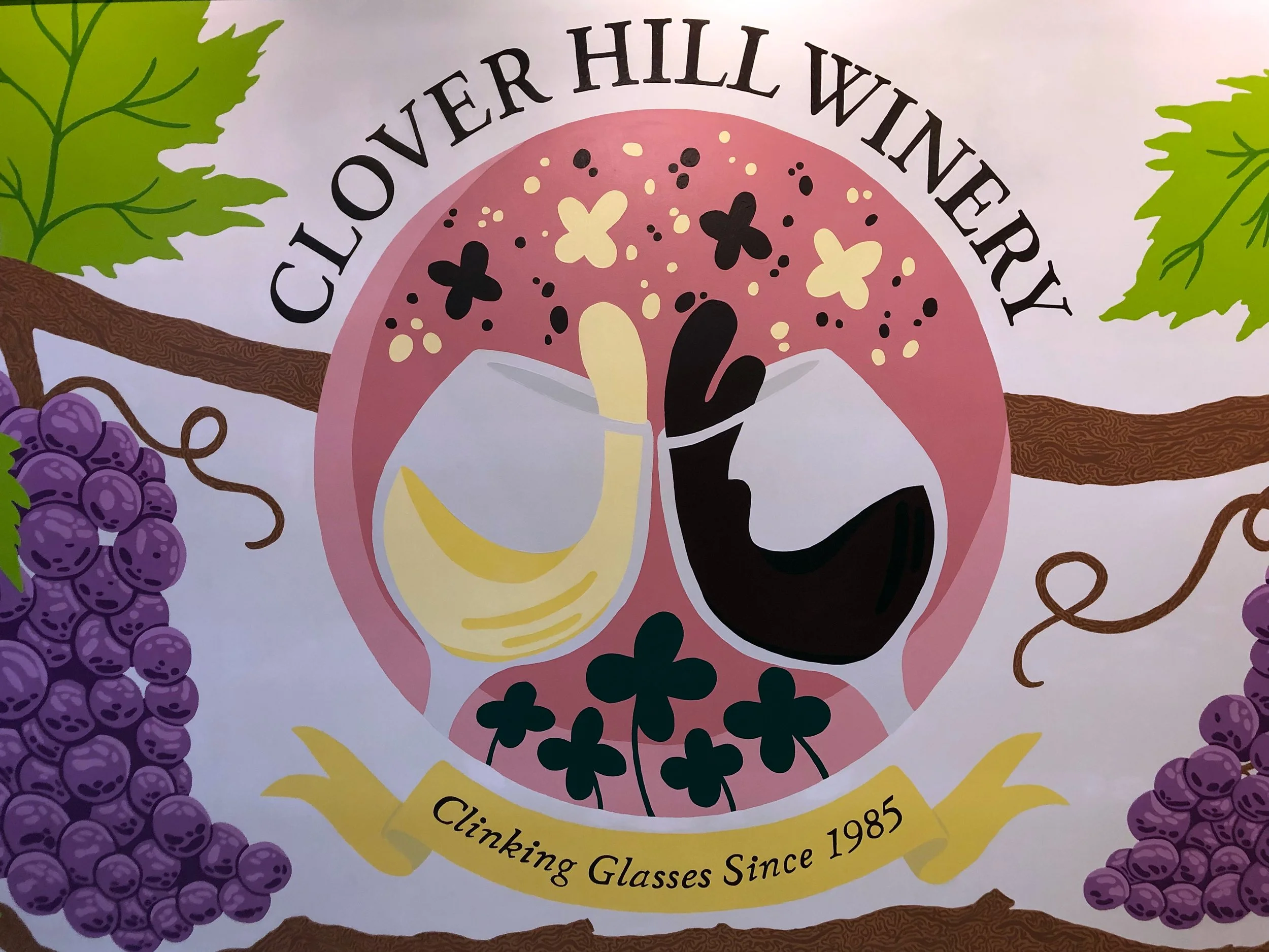
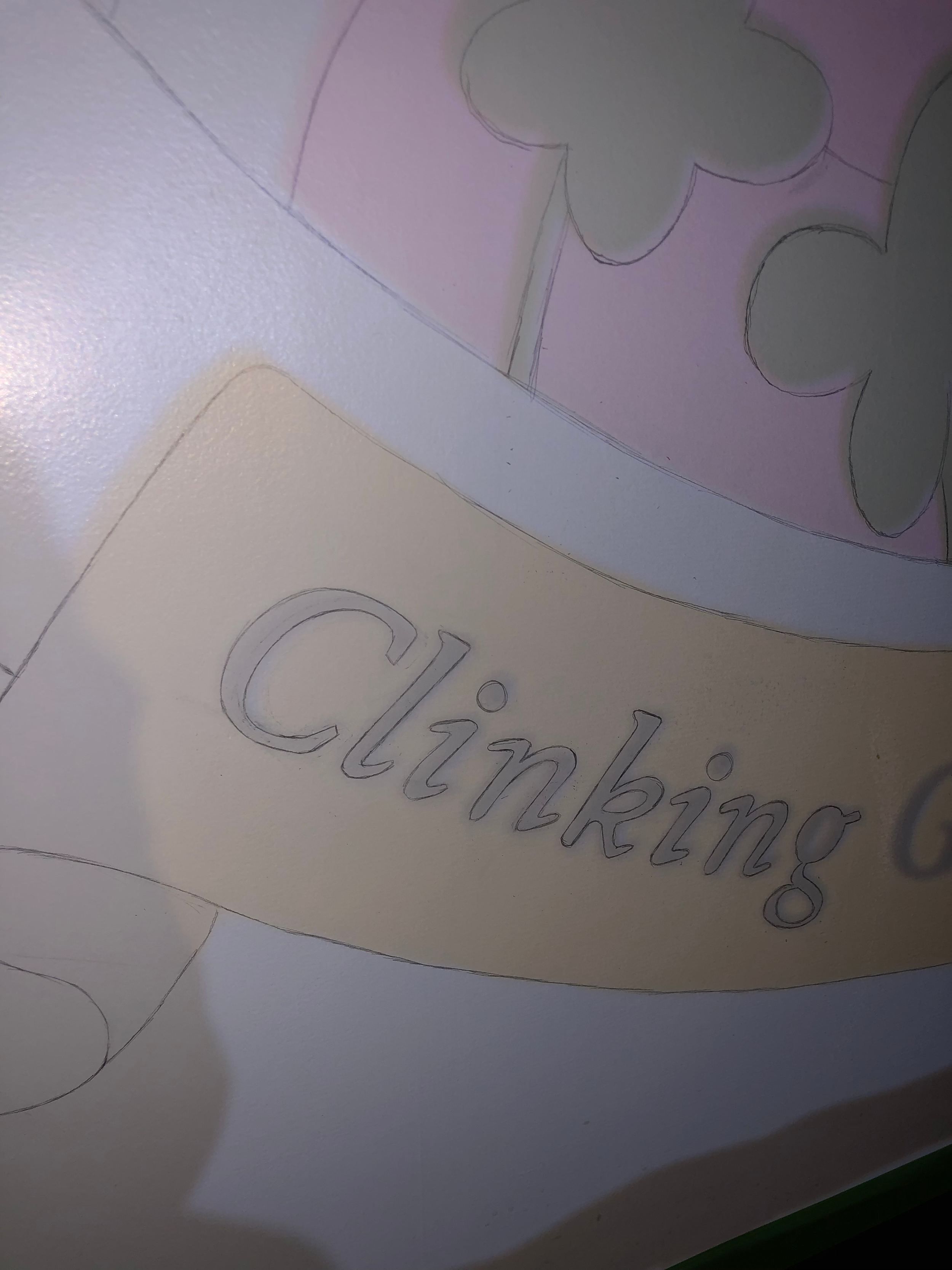
The three previous sketches all had aspects that were used in the final idea: Pat’s glass of white wine clinking John’s glass of red wine– cheering to everything they’ve grown together! I used Procreate to digitally conjure a cleaner illustration and started playing with what the colors could look like.
We knew right away that the purples and greens in my digital piece were way too dark, so I shot for their brighter & bolder versions.

Choosing colors…
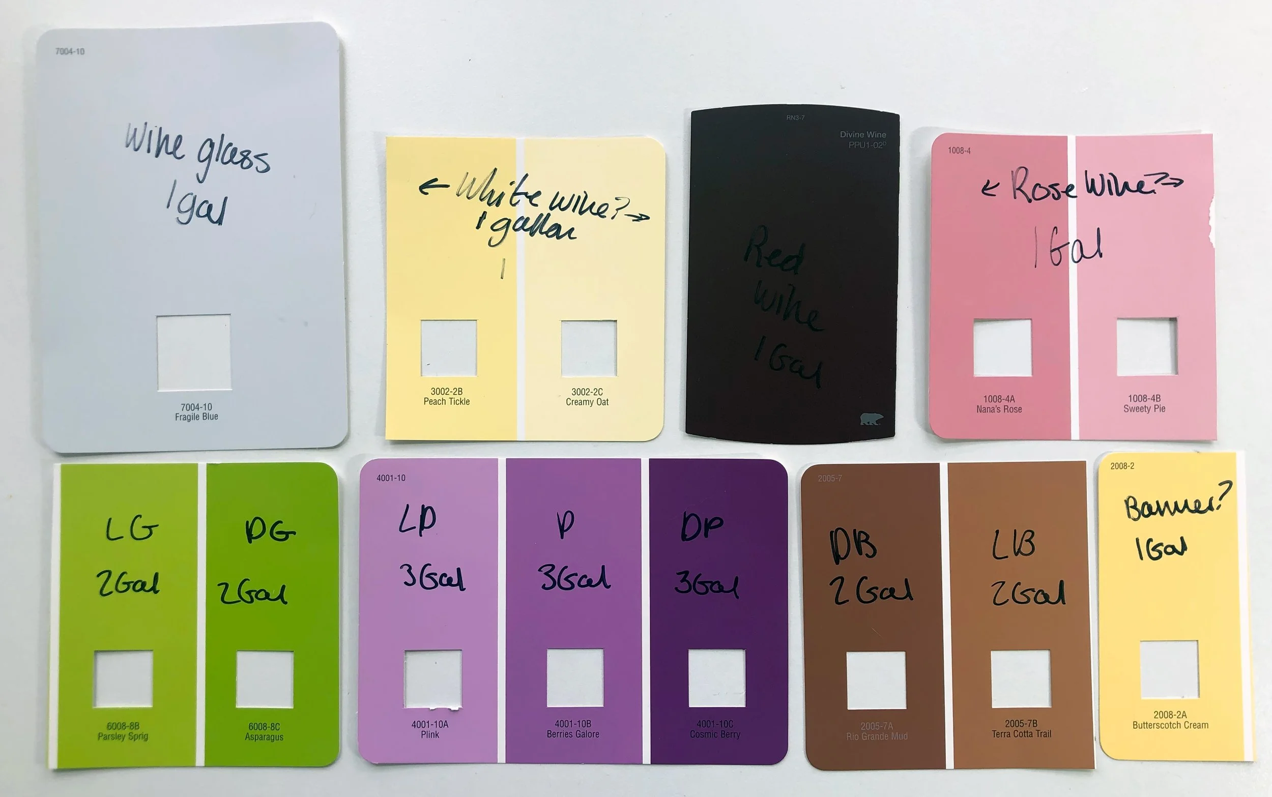
Choosing colors for any project can be daunting, but it also proves to be one of my favorite parts of the process! I especially enjoy it when they have names. I ended up using Valspar Ultra & Superior interior paints, the colors are as follows:
Fragile Blue
Wine Glass
Peach Tickle / Creamy Oat
White Wine
Divine Wine
Red Wine
Nana’s Rose / Sweety Pie
Rosé Wine
Parsley Sprig / Asparagus
Leaves
Plink / Berries Galore / Cosmic Berry
Grapes
Rio Grande Mud / Terra Cotta Trail
Branches
Butterscotch Cream
Banner
*Additional colors were created by mixing what I had around.

Starting work on the wall
Here comes the fun uncharted territory that I got to navigate and figure out!
Getting It Onto the Wall
A timelapse of a section of work applying the outlines of the design to the wall. I used a projector to display my digital drawing on the prepared wall and drew the outlines in pencil. I was hoping it would make it like a paint-by-number so anyone who wanted to help could jump in easily.


More Painting Progress